
FlexLayout in MAUI is a layout that can arrange its children horizontally and vertically in a stack. It is also wrap its children if there are too many children to fit in a single row or column. FlexLayout can control orientation and alignment, and adapt to different screen sizes.
In this article, I’m going to show you how to use FlexLayout in MAUI to add skills.
Let’s Start
1 – Setting up the UI
1.1 – MainPage.xaml
<?xml version="1.0" encoding="utf-8" ?>
<ContentPage xmlns="http://schemas.microsoft.com/dotnet/2021/maui"
             xmlns:x="http://schemas.microsoft.com/winfx/2009/xaml"
             xmlns:converter="clr-namespace:MAUIFlextLayout"
             x:Class="MAUIFlextLayout.MainPage">

     <ContentPage.Resources>
            <converter:StringToReverseBoolConverter x:Key="IsLableShow" />
            <converter:StringToViewSizeStringConverter x:Key="ViewSizeConverter" />
    </ContentPage.Resources>

    <ScrollView Padding="0,0,0,20">
        <VerticalStackLayout
            Spacing="15"
            Padding="20,20"
            VerticalOptions="Start">

            <Image
                Source="dotnet_bot.png"
                SemanticProperties.Description="Cute dot net bot waving hi to you!"
                HeightRequest="200"
                HorizontalOptions="Center" />

            <Label Text="Skills : "
                   FontSize="20"
                   Margin="5,0,0,0"
                   FontAttributes="Bold"/>

            <FlexLayout
                    x:Name="FlexSkillContainer"
                    Margin="5,-10,5,5"
                    AlignContent="Start"
                    AlignItems="Start"
                    HorizontalOptions="FillAndExpand"
                    VerticalOptions="Fill"
                    Direction="Row"
                    JustifyContent="Start"
                    BindableLayout.ItemsSource="{Binding Skills}"
                    Wrap="Wrap" >

                   <BindableLayout.ItemTemplate>
                        <DataTemplate>
                             <Frame
                                Margin="2"
                                Padding="4"
                                BackgroundColor="{StaticResource ColorFocused}"
                                CornerRadius="15">
                                   <StackLayout
                                        Margin="5,0,5,0"
                                        Orientation="Horizontal">

                                            <Label
                                                x:Name="LabelSkill"
                                                FontSize="18"
                                                Text="{Binding .}"
                                                Margin="5,0,5,0"
                                                TextColor="{StaticResource ColorWhite}"
                                                VerticalOptions="Center" />

                                            <Image
                                                x:Name="ImgCross"
                                                HeightRequest="24"
                                                HorizontalOptions="End"
                                                Source="cross.png"
                                                VerticalOptions="Center"
                                                WidthRequest="24">

                                                <Image.GestureRecognizers>
                                                    <TapGestureRecognizer Tapped="OnDeleteSkillClicked" />
                                                </Image.GestureRecognizers>

                                            </Image>

                                 </StackLayout>
                             </Frame>
                        </DataTemplate>
                   </BindableLayout.ItemTemplate>

             </FlexLayout>

            <FlexLayout Direction="Row" HeightRequest="50">

                <Entry
                    x:Name="SkillEntry"
                    Margin="5"
                    FlexLayout.Basis="{Binding Source={x:Reference SkillEntry}, Path=Text, Converter={StaticResource ViewSizeConverter}}"
                    FontSize="20"
                    HeightRequest="50"
                    VerticalOptions="Fill"
                    HorizontalOptions="FillAndExpand"
                    Keyboard="Text"
                    Placeholder="Add Skill" />

                <Image
                    x:Name="ImageCheck"
                    FlexLayout.Basis="10%"
                    HeightRequest="35"
                    FlexLayout.AlignSelf="Center"
                    VerticalOptions="CenterAndExpand"
                    IsVisible="{Binding Source={x:Reference SkillEntry}, Path=Text, Converter={StaticResource IsLableShow}}"
                    Source="check.png"
                    WidthRequest="35">

                    <Image.GestureRecognizers>
                        <TapGestureRecognizer Tapped="TapGestureRecognizer_Tapped"/>
                    </Image.GestureRecognizers>
                 </Image>

            </FlexLayout>

        </VerticalStackLayout>
    </ScrollView>

</ContentPage>
- As in the above MainPage.xaml I have used two FlexLayout first FlexLayout has used for showing the list of skills and second FlexLayout contains ‘Entry’ and ‘Image’.
- I have used below properties in FlexLayout:
- Direction=”Row” => Children will appear horizontally.
- JustifyContent=”Start” => Children will aligned from start without any spacing.
- Wrap=”Wrap” => FlexLayout will wrap its children. If there are too many children to fit in a single row.
- In the second FlexLayout i have used FlexLayout.Basis attached property to its children.
- FlexLayout.Basis, defines the amount of space that’s allocated to a child on the main axis.
- For Entry i have used StringToViewSizeStringConverter converter to manage the width size.
2 – Create a StringToViewSizeStringConverter.cs converter
using System;
using Microsoft.Maui.Layouts;
using System.Globalization;

namespace MAUIFlextLayout
{
    public class StringToViewSizeStringConverter : IValueConverter
    {
        public StringToViewSizeStringConverter()
        {
        }

        public object Convert(object value, Type targetType, object parameter, CultureInfo culture)
        {
            string val = (string)value;

            if (!string.IsNullOrEmpty(val))
            {
                return new FlexBasis(0.90f, true);
            }
            else
            {
                return new FlexBasis(1f, true);
            }
        }

        public object ConvertBack(object value, Type targetType, object parameter, CultureInfo culture)
        {
            return !((bool)value);
        }
    }
}
- As in the above StringToViewSizeStringConverter.cs If Entry text length is more than 1 then StringToViewSizeStringConverter converter will return 90% of FlexBasis else 100% FlexBasis.
- And I have used another StringToReverseBoolConverter converter to Image for hiding and showing.
3 – Create another StringToReverseBoolConverter.cs converter
using System;
using System.Globalization;

namespace MAUIFlextLayout
{
    public class StringToReverseBoolConverter : IValueConverter
    {
        public StringToReverseBoolConverter()
        {
        }

        public object Convert(object value, Type targetType, object parameter, CultureInfo culture)
        {
            string val = (string)value;

            if (!string.IsNullOrEmpty(val))
            {
                if (val.Length > 0)
                {
                    return true;
                }
                else
                {
                    return false;
                }
            }
            else
            {
                return false;
            }
        }

        public object ConvertBack(object value, Type targetType, object parameter, CultureInfo culture)
        {
            return !((bool)value);
        }
    }
}
- If Entry text length is more than 1 then image icon will be visible else not visible.
4 – Manage Add/Delete skills in MainPage.xaml.cs
using System.Collections.ObjectModel;
using System.ComponentModel;

namespace MAUIFlextLayout;

public partial class MainPage : ContentPage, INotifyPropertyChanged
{
    private ObservableCollection<string> _skills;
    public ObservableCollection<string> Skills
    {
        get
        {
            return _skills;
        }
        set
        {
            _skills = value;
            OnPropertyChanged("Skills");
        }
    }

	public MainPage()
	{
		InitializeComponent();
        Skills = new ObservableCollection<string>();
        BindingContext = this;
    }

    void OnAddSkillClicked(System.Object sender, System.EventArgs e)
    {
        Skills.Add(SkillEntry.Text);
        SkillEntry.Text = "";
    }

    void OnDeleteSkillClicked(System.Object sender, System.EventArgs e)
    {
        string skill = (sender as Image).BindingContext as string;

        if(!string.IsNullOrEmpty(skill))
        {
            Skills.Remove(skill);
        }
    }
}
Now, We have completed the coding, Let’s try to run the application.
5 – Result
That’s all for now!
You can check the full source code here.
Happy Coding! 😀
You may also like
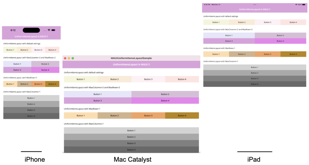
How to use UniformItemsLayout in MAUI
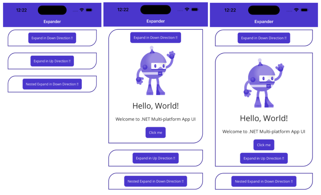
How to use Expander in MAUI
Perfect piece of work you have done, this site is really cool with superb info .