
The Xamarin.CommunityToolkit Expander in MAUI view provides an expandable container to host any content. It has two main properties to store your content that is Header & Content. User can show or hide its content by interacting with the header of the control.
In this article, I’m going to show you how to use Expander in MAUI Community Toolkit.
Expander has “Direction” property which defines the expander direction.
| ExpandDirection “Down” => It indicates that the Expander content is under the header. “Up” => It indicates that the Expander content is above the header. |
| Note : Expander is not supported inside CollectionView or ListView. May be in future version of .NET MAUI Community Toolkit will support. |
Let’s Start
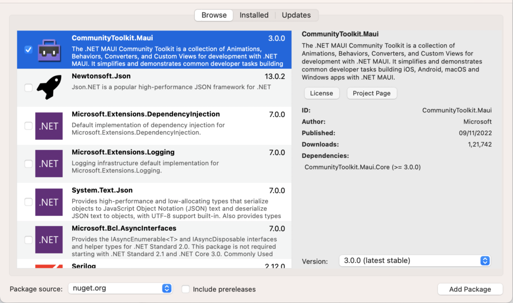
In this sample demo we will use CommunityToolkit.Maui nuget package.
CommunityToolkit.Maui
CommunityToolkit.Maui is a collection of Converters, Behaviours, Animations, Custom Views, Effects, Helpers etc. It simplifies the developers task when building Android, iOS, macOS and WinUI applications using MAUI.
1 – Install CommunityToolkit.Maui nuget package
2 – In order to use the .NET MAUI Community Toolkit you need to call the extension method in your MauiProgram.cs file as follows :
using CommunityToolkit.Maui;
using Microsoft.Extensions.Logging;

namespace MAUIExpanderViewSample;

public static class MauiProgram
{
	public static MauiApp CreateMauiApp()
	{
		var builder = MauiApp.CreateBuilder();
		builder
			.UseMauiApp<App>()
			.UseMauiCommunityToolkit()
			.ConfigureFonts(fonts =>
			{
				fonts.AddFont("OpenSans-Regular.ttf", "OpenSansRegular");
				fonts.AddFont("OpenSans-Semibold.ttf", "OpenSansSemibold");
			});

#if DEBUG
		builder.Logging.AddDebug();
#endif

		return builder.Build();
	}
}
3 – Setting up the UI
3.1 – MainPage.xaml
<?xml version="1.0" encoding="utf-8" ?>
<ContentPage xmlns="http://schemas.microsoft.com/dotnet/2021/maui"
             xmlns:x="http://schemas.microsoft.com/winfx/2009/xaml"
             xmlns:toolkit="http://schemas.microsoft.com/dotnet/2022/maui/toolkit"
             x:Class="MAUIExpanderViewSample.MainPage">

    <ScrollView Padding="10"
                VerticalScrollBarVisibility="Always"
                VerticalOptions="FillAndExpand">
        <StackLayout
            Spacing="25"
            Padding="10,0"
            VerticalOptions="Start">

            <!--Expander in Down Direction-->
            <Border Stroke="#2B0B98"
                    StrokeThickness="4"
                    StrokeShape="RoundRectangle 40,0,0,40"
                    Background="#fff"
                    Padding="16,8"
                    HorizontalOptions="FillAndExpand">

                <toolkit:Expander Direction="Down">
                    <toolkit:Expander.Header>
                          <Button Text="Expand in Down Direction !!"  HorizontalOptions="CenterAndExpand"/>
                    </toolkit:Expander.Header>

                    <toolkit:Expander.Content>
                        <VerticalStackLayout Spacing="20" Padding="10">
                            <Image
                                Source="dotnet_bot.png"
                                SemanticProperties.Description="Cute dot net bot waving hi to you!"
                                HeightRequest="200"
                                HorizontalOptions="Center" />

                            <Label
                                Text="Hello, World!"
                                SemanticProperties.HeadingLevel="Level1"
                                FontSize="32"
                                HorizontalOptions="Center" />

                            <Label
                                Text="Welcome to .NET Multi-platform App UI"
                                SemanticProperties.HeadingLevel="Level2"
                                SemanticProperties.Description="Welcome to dot net Multi platform App U I"
                                FontSize="18"
                                HorizontalOptions="Center" />

                            <Button
                            x:Name="CounterBtn"
                            Text="Click me"
                            SemanticProperties.Hint="Counts the number of times you click"
                            Clicked="OnCounterClicked"
                            HorizontalOptions="Center" />
                        </VerticalStackLayout>
                    </toolkit:Expander.Content>

               </toolkit:Expander>
            </Border>

            <!--Expander in Up Direction-->
            <Border Stroke="#2B0B98"
                    StrokeThickness="4"
                    StrokeShape="RoundRectangle 40,0,0,40"
                    Background="#fff"
                    Padding="16,8"
                    HorizontalOptions="FillAndExpand">

                <toolkit:Expander Direction="Up">
                    <toolkit:Expander.Header>
                          <Button Text="Expand in Up Direction !!" HorizontalOptions="CenterAndExpand"/>
                    </toolkit:Expander.Header>

                    <toolkit:Expander.Content>
                        <VerticalStackLayout Spacing="20" Padding="10">
                            <Image
                                Source="dotnet_bot.png"
                                SemanticProperties.Description="Cute dot net bot waving hi to you!"
                                HeightRequest="200"
                                HorizontalOptions="Center" />

                            <Label
                                Text="Hello, World!"
                                SemanticProperties.HeadingLevel="Level1"
                                FontSize="32"
                                HorizontalOptions="Center" />

                            <Label
                                Text="Welcome to .NET Multi-platform App UI"
                                SemanticProperties.HeadingLevel="Level2"
                                SemanticProperties.Description="Welcome to dot net Multi platform App U I"
                                FontSize="18"
                                HorizontalOptions="Center" />

                            <Button
                            Text="Click me"
                            SemanticProperties.Hint="Counts the number of times you click"
                            Clicked="OnCounterClicked"
                            HorizontalOptions="Center" />
                        </VerticalStackLayout>
                    </toolkit:Expander.Content>

               </toolkit:Expander>
            </Border>

            <!--Nested Expander in Down Direction-->
            <Border Stroke="#2B0B98"
                    StrokeThickness="4"
                    StrokeShape="RoundRectangle 40,0,0,40"
                    Background="#fff"
                    Padding="16,8"
                    HorizontalOptions="FillAndExpand">

                <toolkit:Expander Direction="Down">
                    <toolkit:Expander.Header>
                          <Button Text="Nested Expand in Down Direction !!" HorizontalOptions="CenterAndExpand"/>
                    </toolkit:Expander.Header>

                    <toolkit:Expander.Content>
                        <VerticalStackLayout Spacing="20" Padding="10">

                            <toolkit:Expander Direction="Down">
                                <toolkit:Expander.Header>
                                    <Image
                                        Source="dotnet_bot.png"
                                        SemanticProperties.Description="Cute dot net bot waving hi to you!"
                                        HeightRequest="200"
                                        HorizontalOptions="Center" />
                               </toolkit:Expander.Header>
                                <toolkit:Expander.Content>
                                    <toolkit:Expander Direction="Down">
                                        <toolkit:Expander.Header>
                                            <Label
                                                Text="Hello, World!"
                                                SemanticProperties.HeadingLevel="Level1"
                                                FontSize="32"
                                                HorizontalOptions="Center" />
                                        </toolkit:Expander.Header>
                                        <toolkit:Expander.Content>
                                            <toolkit:Expander Direction="Down">
                                                <toolkit:Expander.Header>
                                                    <Label
                                                        Text="Welcome to .NET Multi-platform App UI"
                                                        SemanticProperties.HeadingLevel="Level2"
                                                        SemanticProperties.Description="Welcome to dot net Multi platform App U I"
                                                        FontSize="18"
                                                        HorizontalOptions="Center" />
                                                </toolkit:Expander.Header>
                                                <toolkit:Expander.Content>
                                                    <Button
                                                        Text="Click me"
                                                        SemanticProperties.Hint="Counts the number of times you click"
                                                        Clicked="OnCounterClicked"
                                                        HorizontalOptions="Center" />
                                                </toolkit:Expander.Content>
                                            </toolkit:Expander>
                                        </toolkit:Expander.Content>

                                    </toolkit:Expander>
                                </toolkit:Expander.Content>
                            </toolkit:Expander>
                        </VerticalStackLayout>
                    </toolkit:Expander.Content>

               </toolkit:Expander>
            </Border>

        </StackLayout>
    </ScrollView>

</ContentPage>
3.2 – MainPage.xaml.cs
namespace MAUIExpanderViewSample;

public partial class MainPage : ContentPage
{
	int count = 0;

	public MainPage()
	{
		InitializeComponent();
	}

	private void OnCounterClicked(object sender, EventArgs e)
	{
		count++;

		if (count == 1)
			CounterBtn.Text = $"Clicked {count} time";
		else
			CounterBtn.Text = $"Clicked {count} times";

		SemanticScreenReader.Announce(CounterBtn.Text);
	}
}
Now, We have completed the coding, Let’s try to run the application.
4 – Result
That’s all for now!
You can check the full source code here.
Happy Coding! 😀
You may also like
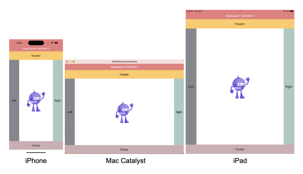
How to use DockLayout in MAUI
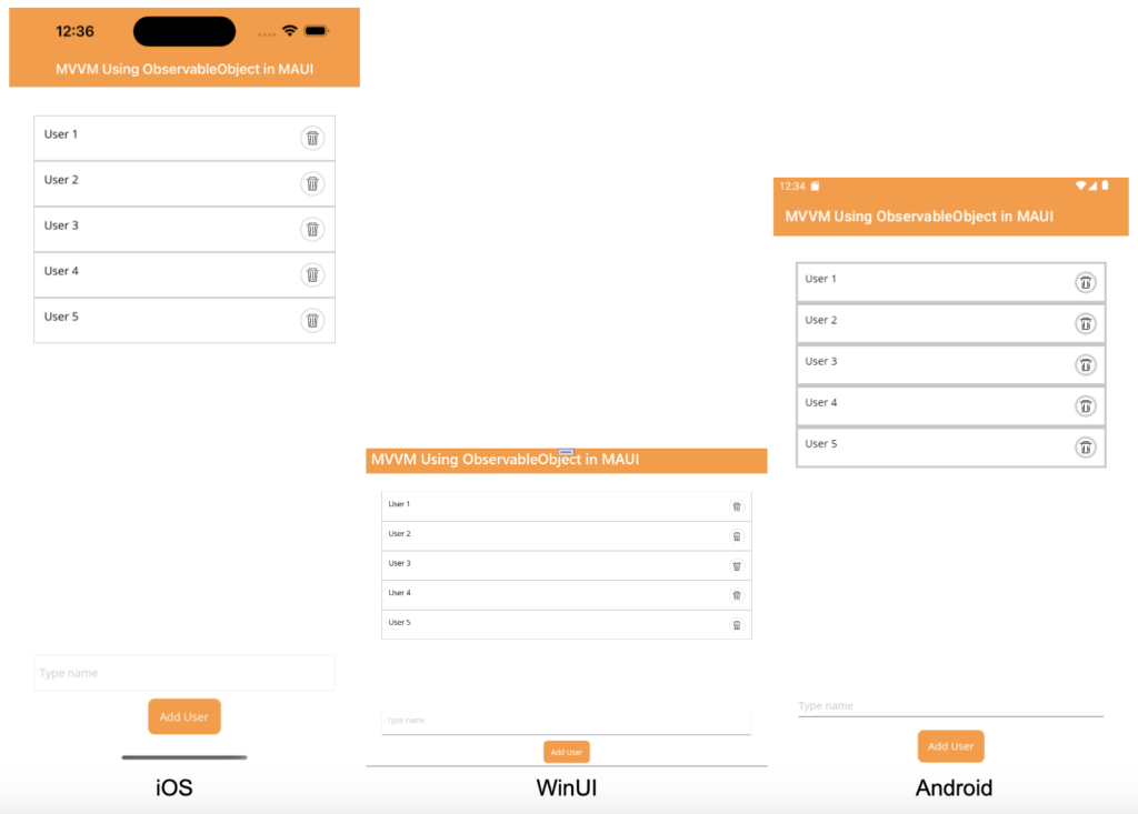
How to use ObservableObject in MAUI for Data Binding
Thanks
How create circle menu in maui?
Help me