
The Xamarin.CommunityToolkit StateContainer in MAUI is a layout which displaying a specific view when your app is in a specific state. StateContainer is an attached properties which enables the user to turn any layout into a state-aware layout. In this article, I’m going to show you how to use StateContainer in MAUI Community Toolkit.
In this sample demo i will take three different custom states like ‘Loading‘, ‘Empty‘ and ‘Success‘
| Loading : Will show before loading users. Empty : Will show when user not available. Success : Will show when user available. |
Let’s Start
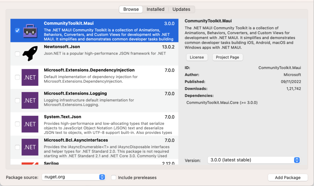
In this sample demo we will use CommunityToolkit.Maui nuget package.
CommunityToolkit.Maui
CommunityToolkit.Maui is a collection of Converters, Behaviours, Animations, Custom Views, Effects, Helpers etc. It simplifies the developers task when building Android, iOS, macOS and WinUI applications using MAUI.
1 – Install CommunityToolkit.Maui nuget package
2 – In order to use the .NET MAUI Community Toolkit you need to call the extension method in your MauiProgram.cs file as follows:
using CommunityToolkit.Maui;
using Microsoft.Extensions.Logging;

namespace MAUIStateContainerLayoutSample;

public static class MauiProgram
{
    public static MauiApp CreateMauiApp()
    {
        var builder = MauiApp.CreateBuilder();
        builder
            .UseMauiApp<App>()
            .UseMauiCommunityToolkit()
            .ConfigureFonts(fonts =>
            {
                fonts.AddFont("OpenSans-Regular.ttf", "OpenSansRegular");
                fonts.AddFont("OpenSans-Semibold.ttf", "OpenSansSemibold");
            });

#if DEBUG
        builder.Logging.AddDebug();
#endif

        return builder.Build();
    }
}
3 – Setting up the UI
3.1 – Create a MainPage.xaml
<?xml version="1.0" encoding="utf-8" ?>
<ContentPage
    x:Class="MAUIStateContainerLayoutSample.MainPage"
    xmlns="http://schemas.microsoft.com/dotnet/2021/maui"
    xmlns:x="http://schemas.microsoft.com/winfx/2009/xaml"
    xmlns:toolkit="http://schemas.microsoft.com/dotnet/2022/maui/toolkit"
    x:Name="MainPageContainer">

    <ScrollView>
        <StackLayout Padding="20" Spacing="10">

            <Image
                HeightRequest="150"
                HorizontalOptions="Center"
                SemanticProperties.Description="Cute dot net bot waving hi to you!"
                Source="dotnet_bot.png">

                <Image.Behaviors>
                    <toolkit:IconTintColorBehavior TintColor="Red" />
                </Image.Behaviors>
            </Image>

            <VerticalStackLayout
                toolkit:StateContainer.CurrentState="{Binding CurrentState}"
                toolkit:StateContainer.ShouldAnimateOnStateChange="True"
                Spacing="25"
                VerticalOptions="CenterAndExpand">

                <toolkit:StateContainer.StateViews>

                    <!--  Loading State  -->
                    <VerticalStackLayout toolkit:StateView.StateKey="Loading">
                        <ActivityIndicator
                            HeightRequest="25"
                            HorizontalOptions="CenterAndExpand"
                            IsRunning="True"
                            VerticalOptions="CenterAndExpand"
                            WidthRequest="25"
                            Color="Red" />

                        <Label
                            HorizontalOptions="CenterAndExpand"
                            HorizontalTextAlignment="Center"
                            Text="Loading ..." />
                    </VerticalStackLayout>

                    <!--  Empty State  -->
                    <VerticalStackLayout toolkit:StateView.StateKey="Empty">

                        <Image
                            HeightRequest="200"
                            HorizontalOptions="Center"
                            Source="empty.png" />

                    </VerticalStackLayout>

                    <!--  Success State  -->
                    <StackLayout
                        toolkit:StateView.StateKey="Success"
                        BindableLayout.ItemsSource="{Binding UserList}"
                        HorizontalOptions="FillAndExpand"
                        VerticalOptions="FillAndExpand">
                        <BindableLayout.ItemTemplate>
                            <DataTemplate>
                                <Frame Padding="5" CornerRadius="0">
                                    <StackLayout
                                        Padding="10"
                                        HorizontalOptions="FillAndExpand"
                                        Orientation="Horizontal"
                                        VerticalOptions="FillAndExpand">
                                        <Label
                                            x:Name="UserName"
                                            HorizontalOptions="FillAndExpand"
                                            Text="{Binding .}"
                                            TextColor="Black" />
                                        <Frame
                                            Padding="7"
                                            CornerRadius="15"
                                            HeightRequest="30"
                                            HorizontalOptions="EndAndExpand"
                                            WidthRequest="30">
                                            <Image Source="delete.png" />
                                            <Frame.GestureRecognizers>
                                                <TapGestureRecognizer Command="{Binding BindingContext.DeleteUserCommand, Source={x:Reference MainPageContainer}}" CommandParameter="{Binding .}" />
                                            </Frame.GestureRecognizers>
                                        </Frame>
                                    </StackLayout>
                                </Frame>
                            </DataTemplate>
                        </BindableLayout.ItemTemplate>
                    </StackLayout>

                </toolkit:StateContainer.StateViews>
            </VerticalStackLayout>

            <Entry
                Placeholder="Type name"
                Text="{Binding User}"
                VerticalOptions="EndAndExpand" />

            <Button
                Margin="0,10,0,0"
                Command="{Binding AddUserCommand}"
                HorizontalOptions="CenterAndExpand"
                Text="Add User" />

        </StackLayout>

    </ScrollView>

</ContentPage>
- As in the above MainPage.xaml i have used three different views for Loading state, Empty state and Success state and each view uniquely identified by StateKey.
- CurrentState property determines which view with the corresponding StateKey should be displayed. CurrentState is binded with CurrentState string property in MainPageViewModel.cs so that state can be changed at runtime.
- ShouldAnimateOnStateChange property is used for enabling fade out/in animation while switching between states.
4 – Setting up the ViewModel
4.1 – Create a MainPageViewModel.cs class
using System;
using System.Collections.Generic;
using System.Collections.ObjectModel;
using System.ComponentModel;
using System.Linq;
using System.Runtime.CompilerServices;
using System.Text;
using System.Threading.Tasks;
using System.Windows.Input;

namespace MAUIStateContainerLayoutSample
{
    public class MainPageViewModel : INotifyPropertyChanged
    {
        public event PropertyChangedEventHandler PropertyChanged;
        public ICommand AddUserCommand { get; set; }
        public ICommand DeleteUserCommand { get; set; }

        private ObservableCollection<string> _list;
        public ObservableCollection<string> UserList
        {
            get => _list;
            set
            {
                _list = value;
                OnPropertyChanged();
            }
        }

        private string _state = "Loading";
        public string CurrentState
        {
            get => _state;
            set
            {
                _state = value;
                OnPropertyChanged();
            }
        }

        private string _user;
        public string User
        {
            get => _user;
            set
            {
                _user = value;
                OnPropertyChanged();
            }
        }

        public MainPageViewModel()
        {
            AddUserCommand = new Command(() =>
            {
                Application.Current.Dispatcher.Dispatch(() =>
                {
                    if (!string.IsNullOrEmpty(User))
                    {
                        UserList.Add(User);

                        if (UserList.Count > 0)
                        {
                            CurrentState = "Success";
                        }

                        User = string.Empty;
                    }
                });
            });

            DeleteUserCommand = new Command<string>((user) =>
            {
                Application.Current.Dispatcher.Dispatch(() =>
                {
                    if (!string.IsNullOrEmpty(user))
                    {
                        UserList.Remove(user);

                        if (UserList.Count <= 0)
                        {
                            CurrentState = "Empty";
                        }
                    }
                });
            });

            // Load list after 5 Second
            Task.Delay(5000).ContinueWith(t => GetList());
        }

        private void GetList()
        {
            UserList = new ObservableCollection<string>()
            {
                "User 1",
                "User 2",
                "User 3",
                "User 4",
            };

            // Change current state from "Loading" to "Success"
            CurrentState = "Success";
        }

        private void OnPropertyChanged([CallerMemberName] string propertyName = null)
        {
            PropertyChanged?.Invoke(this, new PropertyChangedEventArgs(propertyName));
        }
    }
}
Now, We have completed the coding, Let’s try to run the application.
5 – Result
That’s all for now!
You can check the full source code here.
Happy Coding! 😀
You may also like
How to use CollectionView as a GridItemLayout in Xamarin Forms

How to rotate views on orientation change in Xamarin Forms
Hi, The link to the source code is broken.
Hey Johan Tempelman, Thanks for your comment. Now link to source code is available. Please check
Nice writeup
Thanks Navin Prasad
Hi, please make tutorial on G pay integration in MAUI
interesting post
_________________
слоты в 1xbet приложение
Thanks for the post
_________________
pin up casino бест
very good
_________________
netgame casino бездепозитный бонус
some genuinely interesting information, well written and broadly speaking user friendly.