Sometimes we need the same image in two different colors (eg : enable/disable image) to show based on some conditions. So taking two images is not the right way. We need to use one image instead of two and based on some condition we need to change the color of the same image. So In this article, I’m going to show you how to apply color to images and icons in MAUI.
Let’s Start
The MAUI community toolkit provides us with IconTintColorBehavior to change the color of an image and icon.
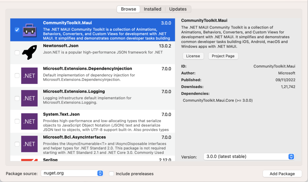
In this sample demo we will use CommunityToolkit.Maui nuget package.
CommunityToolkit.Maui
CommunityToolkit.Maui is a collection of Converters, Behaviours, Animations, Custom Views, Effects, Helpers etc. It simplifies the developers task when building Android, iOS, macOS and WinUI applications using MAUI.
1 – Install CommunityToolkit.Maui nuget package
2 – In order to use the .NET MAUI Community Toolkit we need to call the extension method in MauiProgram.cs file as follows
using CommunityToolkit.Maui;
using Microsoft.Extensions.Logging;

namespace MAUIImageTintingSample;

public static class MauiProgram
{
    public static MauiApp CreateMauiApp()
    {
        var builder = MauiApp.CreateBuilder();
        builder
            .UseMauiApp<App>()
            .UseMauiCommunityToolkit()
            .ConfigureFonts(fonts =>
            {
                fonts.AddFont("OpenSans-Regular.ttf", "OpenSansRegular");
                fonts.AddFont("OpenSans-Semibold.ttf", "OpenSansSemibold");
            });

#if DEBUG
        builder.Logging.AddDebug();
#endif

        return builder.Build();
    }
}
3 – Setting up the UI
3.1 – Create a MainPage.xaml
<?xml version="1.0" encoding="utf-8" ?>
<ContentPage xmlns="http://schemas.microsoft.com/dotnet/2021/maui"
             xmlns:x="http://schemas.microsoft.com/winfx/2009/xaml"
             x:Class="MAUIImageTintingSample.MainPage"
             xmlns:vm="clr-namespace:MAUIImageTintingSample"
             xmlns:toolkit="http://schemas.microsoft.com/dotnet/2022/maui/toolkit"
             x:Name="MainContainer">

    <ContentPage.BindingContext>
        <vm:MainPageViewModel />
    </ContentPage.BindingContext>

    <ScrollView>
        <VerticalStackLayout
            Spacing="25"
            Padding="20,10">

            <Image
                Source="dotnet_bot.png"
                HeightRequest="200"
                vm:TintColorBehavior.AttachBehavior="{Binding IsAttached}"
                HorizontalOptions="Center"/>

            <HorizontalStackLayout Spacing="10" HorizontalOptions="CenterAndExpand">

                <Image Source="camera.png" vm:TintColorBehavior.AttachBehavior="{Binding IsAttached}"/>

                <Image Source="heart.png" vm:TintColorBehavior.AttachBehavior="{Binding IsAttached}"/>

                <Image Source="home.png" vm:TintColorBehavior.AttachBehavior="{Binding IsAttached}"/>

                <Image Source="settings.png" vm:TintColorBehavior.AttachBehavior="{Binding IsAttached}"/>

                <Image Source="user.png" vm:TintColorBehavior.AttachBehavior="{Binding IsAttached}"/>

            </HorizontalStackLayout>

            <FlexLayout
                x:Name="StackColorList"
                AlignItems="Center"
                BindableLayout.ItemsSource="{Binding Colors}"
                Direction="Row"
                FlexLayout.AlignSelf="Center"
                HorizontalOptions="FillAndExpand"
                JustifyContent="Center"
                Wrap="Wrap">
                <BindableLayout.ItemTemplate>
                    <DataTemplate>
                        <Button
                            BackgroundColor="{Binding Color}"
                            BorderColor="Transparent"
                            BorderWidth="2"
                            Command="{Binding BindingContext.ColorItemClickedCommand, Source={x:Reference MainContainer}}"
                            CommandParameter="{Binding .}"
                            CornerRadius="0"
                            HeightRequest="100"
                            WidthRequest="100">
                            <Button.Triggers>
                                <DataTrigger
                                    Binding="{Binding IsSelected}"
                                    TargetType="Button"
                                    Value="True">
                                    <Setter Property="BorderColor" Value="Red" />
                                </DataTrigger>
                            </Button.Triggers>
                        </Button>
                    </DataTemplate>
                </BindableLayout.ItemTemplate>
            </FlexLayout>

            <Button
                x:Name="CounterBtn"
                Text="Change Image Color"
                Command="{Binding ChangeImageTintColorCommand}"
                HorizontalOptions="Center" />

        </VerticalStackLayout>
    </ScrollView>

</ContentPage>
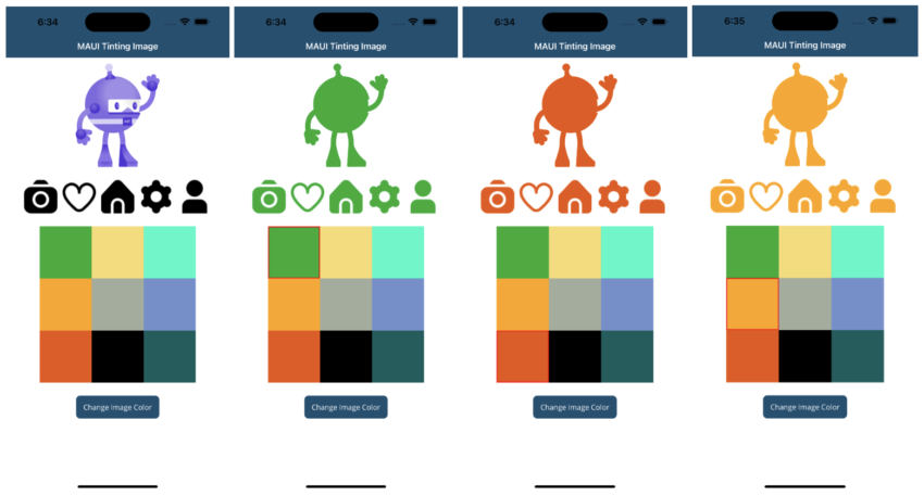
- As in the above MainPage.xaml I have used a bindable layout to show a list of colors and button to change the images color.
- So when a user selects a color from a list and clicks on the change image color button then that picked color will be applied to the images.
- And I have also created a TintColorBehavior for attaching/detaching the IconTintColorBehavior at runtime.
3.2 – Create a TintColorBehavior
using CommunityToolkit.Maui.Behaviors;

namespace MAUIImageTintingSample
{
    public class TintColorBehavior : Behavior<Image>
    {
        public static readonly BindableProperty AttachBehaviorProperty =
       BindableProperty.CreateAttached("AttachBehavior", typeof(bool), typeof(TintColorBehavior), false, propertyChanged: OnAttachBehaviorChanged);

        public static bool GetAttachBehavior(BindableObject view)
        {
            return (bool)view.GetValue(AttachBehaviorProperty);
        }

        public static void SetAttachBehavior(BindableObject view, bool value)
        {
            view.SetValue(AttachBehaviorProperty, value);
        }

        static void OnAttachBehaviorChanged(BindableObject view, object oldValue, object newValue)
        {
            var image = view as Image;
            if (image == null)
                return;

            bool attachBehavior = (bool)newValue;
            if (attachBehavior)
            {
                image.Behaviors.Add(new IconTintColorBehavior() { TintColor = (image.BindingContext as MainPageViewModel).Color });
            }
            else
            {
                var toRemove = image.Behaviors.FirstOrDefault(b => b is IconTintColorBehavior);
                if (toRemove != null)
                {
                    image.Behaviors.Remove(toRemove);
                }
            }
        }
    }
}
- As in the above TintColorBehavior behavior, I have created an attached property which is used for attaching or detaching the behavior from viewmodel.
- So when the attached property gets changed then the OnAttachBehaviorChanged method gets executed.
- And in this method based on the value, I am adding/removing the IconTintColorBehavior behavior to/from image.
- The TintColor property of IconTintColorBehavior behavior is used for setting the color of the image.
- So I am getting the selected color from color list and setting to the TintColor property.
- We can also attach the IconTintColorBehavior behavior to image from xaml :
 <Image Source="user.png">
        <Image.Behaviors>
            <toolkit:IconTintColorBehavior TintColor="Red" />
        </Image.Behaviors>
 </Image>
We need to import toolkit namespace as follows :
xmlns:toolkit="http://schemas.microsoft.com/dotnet/2022/maui/toolkit"
4 – Setting up the ViewModel
using System.Collections.ObjectModel;
using System.ComponentModel;
using System.Runtime.CompilerServices;
using System.Windows.Input;

namespace MAUIImageTintingSample
{
    public class MainPageViewModel : INotifyPropertyChanged
    {
        public event PropertyChangedEventHandler PropertyChanged;
        public ICommand ColorItemClickedCommand { get; set; }
        public ICommand ChangeImageTintColorCommand { get; set; }

        private ColorItem _lastSelectedItem;

        private ObservableCollection<ColorItem> _colors;
        public ObservableCollection<ColorItem> Colors
        {
            get { return _colors; }
            set
            {
                _colors = value;
                OnPropertyChanged(nameof(Colors));
            }
        }

        private Color _tintColor = Color.FromRgba("#000000");
        public Color Color
        {
            get { return _tintColor; }
            set
            {
                _tintColor = value;
                OnPropertyChanged(nameof(Color));
            }
        }

        private bool _isAttached;
        public bool IsAttached
        {
            get { return _isAttached; }
            set
            {
                _isAttached = value;
                OnPropertyChanged(nameof(IsAttached));
            }
        }

        public MainPageViewModel()
        {
            ColorItemClickedCommand = new Command<ColorItem>((i) => OnColorItemClicked(i));
            ChangeImageTintColorCommand = new Command(OnChangeImageTintColor);
            Colors = new ObservableCollection<ColorItem>()
            {
                new ColorItem(){ Color = Color.FromArgb("#12AD2B") },
                new ColorItem(){ Color = Color.FromArgb("#F7DC6F") },
                new ColorItem(){ Color = Color.FromArgb("#01F9C6") },
                new ColorItem(){ Color = Color.FromArgb("#FFA500") },
                new ColorItem(){ Color = Color.FromArgb("#A2AD9C") },
                new ColorItem(){ Color = Color.FromArgb("#728FCE") },
                new ColorItem(){ Color = Color.FromArgb("#EB5406") },
                new ColorItem(){ Color = Color.FromArgb("#000000") },
                new ColorItem(){ Color = Color.FromArgb("#045D5D") },
            };
        }
        private void OnColorItemClicked(ColorItem item)
        {
            if (item != null)
            {
                if (_lastSelectedItem != null)
                    _lastSelectedItem.IsSelected = false;
                _lastSelectedItem = item;
                item.IsSelected = true;
            }
        }
        private void OnChangeImageTintColor()
        {
            if (_lastSelectedItem != null)
            {
                IsAttached = false;
                Color = _lastSelectedItem.Color;
                IsAttached = true;
            }
        }
        public void OnPropertyChanged([CallerMemberName] string propertyName = null)
        {
            PropertyChanged?.Invoke(this, new PropertyChangedEventArgs(propertyName));
        }
    }
    public class ColorItem : INotifyPropertyChanged
    {
        private bool _isSelected;
        public bool IsSelected
        {
            get { return _isSelected; }
            set
            {
                _isSelected = value;
                OnPropertyChanged();
            }
        }
        private Color _color;
        public Color Color
        {
            get { return _color; }
            set
            {
                _color = value;
                OnPropertyChanged();
            }
        }
        public event PropertyChangedEventHandler PropertyChanged;
        public void OnPropertyChanged([CallerMemberName] string propertyName = null)
        {
            PropertyChanged?.Invoke(this, new PropertyChangedEventArgs(propertyName));
        }
    }
}
- As in the above MainPageViewModel, I have created a list of colors and bind this to a bindable layout.
- OnColorItemClicked() method called when a user select or pick a color from bindable layout.
- OnChangeImageTintColor() method gets called when a user clicks on the button. This method contains the code to attach/detach the IconTintColorBehavior behavior.
Result
That’s all for now!
You can check the full source code here.
Happy Coding! 😀
You may also like

Implementation Of Biometric Authentication in Xamarin Forms
How to use MediaElement in Xamarin Forms